Pages

Monday, September 10, 2012

Poisoned Peas Please! Steampunk Inspiration

Happy Monday everyone!  I hope you all had a great weekend!
This month over at Poisoned Peas Please!, we're using Simply Betty stamps for our Steampunk challenge.

I chose Betty's "Child of Morella" image after figuring out who Morella is.  Turns out she's "a" character in a very short Edgar Allan Poe poem.  It's a 10 minute read if you want to have a looksee.  She appealed to me because 1. I liked the image (THAT was easy!), 2. I'm from MD and Poe was a Baltimore boy so there's that whole thing and 3. I've just always liked Poe.  Of course, there was the high school English teacher that read "The Raven" to us in a dark classroom, reading by flashlight and periodically shining the light on a very realistic picture of a raven above the door.  I guess that helped too.  LOL.

In a very prosaic nutshell, Morella is a brilliant woman and has extensively read "forbidden and mystical writings."  Her husband, the narrator, at first thinks it's fascinating and then eventually is completely skeeved by it.  Morella dies giving birth to "the child of Morella" who dad never names.  She grows to adolescence VERY quickly and reminds dad hugely of mom.  When he has her baptized, for reasons he doesn't know, he calls her "Morella" and she immediately dies.  When he puts her in the family tomb, mom's no longer there- it's as if she were simply reborn as her own daughter.

Hey!  It's Poe.  What did you expect?  Sunshine and roses?  Well, maybe three roses mysteriously left on his grave but that's a whole different story.

Anywho.  I used the image on a heavily steampunk-embellished tag.
Note: The first image is my updated tag, the 2nd image was my original.


Thank you Betty for the chance to use some of your fantastic images.  Please join us in this challenge for YOUR chance to win some of these great images yourself!  The winner will receive their choice of 3 of these images:


Ingredients:
Paper: (Kraft Glassine): Tim Holtz

Coloring: (Fired Brick, Black Soot, Vintage Photo): Tim Holtz, Copics, Watercolor pencils
Embellishments: (Pin, Clockface, Gears, Metal Flower, Flower die, Watch hand): Tim Holtz, (Typewriter key, Brads): ?, Watch parts, Vintage lace

Saturday, September 8, 2012

Happily Hoppin' for Aletha's Birthday


I received an email a week or so ago asking if I wanted to be part of a surprise blog hop for Aletha Williams' birthday, Sept. 9.  Well heck yeah!  Aletha is the immensely talented lady who's not only asked me to be on one of her design teams but now two.  Heck yeah!

Before I get into this, here's the Lady of Honor as well as the blogs on the hop.  You should have arrived here from Susan's fab space.  If you didn't, you may want to start back at Kristy's, the organizer of this whole celebration.


Photobucket


Aletha’s Birthday blog roll:


So.  A birthday card for Aletha.  I felt like a traitor for this one- one of the teams I'm on is Aletha's ippity DT.  I didn't really use ippity.  I have the Mixed Bunch Stampin' Up set I've been looking for an excuse to ink.  I even have the matching punch that I've been wanting to try out.  So Aletha, while I didn't use MUCH ippity (the leaves!  I didn't totally disgrace myself- I used ippity leaves!), I broke out brand new supplies just for you!  :)  I wanted to make a fairly clean card with a purple flower on it, maybe a bit of ribbon. 
But WAIT!  Based on a short conversation we had last week, I deduced (just call me Sherlock!) that Aletha likes to read... BOOKS.  Actual paper books!  Wouldn't a bookmark be nice?!  So.  You'll notice that the flower looks like it bulges a bit strangely off the page and, well, it does.  That's because a polite little pull (well, maybe a firm twist and tug) should release the glue dot from the ribbon, allowing the ribbon and flower to come off the card and be used as a bookmark.  I tied a ribbon slide to the end to keep the ribbon from fraying and to add a bit of weight to the far end.  That's about the end of my grand ideas for the week!  LOL.

Aletha, I hope you have a WONDERFUL birthday and have some time to enjoy family, friends, crafting and maybe even a bit of reading.  Your card/bookmark should be arriving on Monday.  :)

Before you move onto Sandy's, we have a gift for all of our hoppers!  Tracey Malnofski, a fabulous Unity artista and owner/designer at The Stamping Boutique, has given us this digi to share with you for free because it's one of Aletha's favorite TSB images and is appropriately names "Fairy Aletha."

9/15/12: SORRY.  The free image was removed after the hop.  Please see TSB if you'd like to purchase the image.
   
Thanks for joining us on the hop and don't forget to stop by Aletha's, the last stop, and wish her a very happy birthday!


Ingredients:
Stamps: (Mixed Bunch, Sincere Salutations, Antique Background): Stampin' Up, (Now & Always): ippity

Ink: (Pale Plum, Elegant Eggplant, Eggplant Envy, Basic Black, Green Galore, Certainly Celery, Garden Green): Stampin' Up, (VersaMark): Tsukineko
Paper: (Whisper White, Eggplant Envy): Stampin' Up
Misc: (Ribbon slide): Stampin' Up, (Clear EP): JoAnn's

Challenges: (I feel a bit odd entering this in challenges but I'm SO happy with how it turned out!)
Unique Crafters' Challenge: Anything Goes
Stampendous: Embossing (Unfortunately, it doesn't show up well but the flowers were all stamped with the purple inks, and then VersaMark, then embossed with clear EP to give the bookmark a bit of texture and shine.)
Craft Your Passion: Floral images
DYSU #88: Birthdays

Wednesday, September 5, 2012

Dad's birthday card

My father's birthday is coming up this weekend.  We won't see him and we actually gave him his presents about 2mos. ago (when we last saw him and knew he could use them immediately... why wait?) so I definitely needed to get a card in the mail to him.  I ordered The Open Sea from Stampin' Up just for masculine cards- I think it'll probably see some definitely use.  If you're familiar with this, you may notice that the sea seems... extended?  I added a bit more to make it fill the square a smidge more.

Sorry for the blue tint- I was able to get a picture during one of the rare bits of sun we've had the past few days but it was definitely blue shadows at the time.

Ingredients:
Stamps: (The Open Sea, Sincere Salutations): Stampin' Up

Paper: (Basic Black, Whisper White): Stampin' Up, (Deep Turquoisey paper): ?
Ink: (Basic Black): Stampin' Up, (Broken China, Faded Jeans): Tim Holtz
Twine: ? (received unlabelled in a blog candy pack)

Friday, August 31, 2012

Mama Mia... maybe

A trend I've been loving recently has been the use of View-Master Picture Reels on scrap pages.  Not the stamps of reels, not the chipboard reels, the "reel" deal please.  I was wondering where I could get my hands on a few (ebay of course) and thinking about whether I really needed any.  I mean, really?  I need more?  And then today, while spending a few minutes perusing our garage, I decided to take a peek in some old storage bins I have from childhood.  I knew there were a few old, dusty but can't- be-parted-with books in them and a few slightly forgotten 45's.  What I'd totally forgotten was this bag. 
 

When I picked it up, it crackled insanely- the lining was a plasticky coating that just disintegrated.  However, I knew what else was in it but I'd forgotten the volume.  PAYDIRT... or was it.


I thought they were all falling apart (they're almost all from the 50's and 60's- they SHOULD be falling apart after all these years!) and had no problem tacking a few together for use- hey!  Disney World reels on the pages that will come from this winter's Disney trip?!  SWEET!  But then... the truth.  They're not falling apart.  They're PRISTINE!  The envelopes look like crap but the reels are in excellent condition.  I must have been SO much more anal as a child than I remember (I put a bit of red on the bottom of one foot of each of my Star Wars figures so I knew which were mine and which were the boys'- I didn't want them claiming my exceptionally, clean, politely played-with ones, leaving me stuck with their scratched and demolished ones... I even still have all of the guns.  Yeah, I was THAT kid.)  I remember looking at these reels and I don't understand how they're in such amazing condition.  There are two that have potential- an old Tom & Jerry and a Spike & Tyke, as well as a few Donald Duck films that must have come unglued... all of the film fragments and the reel are in an envelope that in my pre-teen writing, I labelled "Pieces of film and reals".  Seeing that tells me a lot about why I am the way I am today.  LOL.

So.  My dilemma.  I HATE to destroy old things- I do.  I want to keep them useable.  Why?  Who's going to EVER use these?!  Dunno but it's like tearing a book- it just never feels right.  I guess it's just a bit of irretrievable history and once it's gone, it's gone.  But again, what am I EVER going to do with these?  Any one else ever have these issues?

Tuesday, August 28, 2012

Two Wild and Crazy Guys card

I LOVE Lily Chilvers' images over at the Octopode Factory.  LOVE them.  And I have to say I'm totally in like with how this card came out.   I've been wanting to use my Tweedledee and Tweedledum image but just hadn't gotten to them until now.  I saw that there's a circle challenge over at OF and finally had to break the boys out.


I wanted to show the background but Dee and Dum sort of vanished into it (which actually made for a great psychedelic look but not what I was going for) so I double-layered vellum behind them, allowing the background to come through but in a more muted way.  I also pop-dotted the boys to make them stand out even a bit more.  I could have added more to it to dress it all up a bit but I like it plain and simple the way it is.

I also added a freebie OF put out the other month, Keep Calm and Carry On (this is going to a teacher who's about to start back- I felt it's rather appropriate. LOL!)


Ingredients:
Images: Octopode Factory

Ink: (Green Galore, Brilliant Blue): Stampin' Up
Paper: (Vellum, Basic Black, Whisper White): Stampin' Up
Misc: (Texture plate): Fiskars, Copics

Challenges:
  • Octopode Factory: Circles
  • DYSU: #86: Fantasy
  • Craft Your Passion: #125: Embossing  (The circular background was made by rubbing blue and green inks on a embossing/texture plate and then running it through the press- the white circles are raised.)
  • Simon Says Stamp & Show: Inspired by Summer Distress (LOVE the new colors, esp. the Mowed Lawn & Salty Ocean... and the NAMES!  Don't get me started!)

Sunday, August 26, 2012

Snow White for Poisoned Peas Please

Are you familiar with Snow White?  Really?  Are you familiar with the Disneyfied version or the Brothers Grimm Fairy Tale version, the darker version of the German fairy tale?  In the Grimm tale, the queen really has it in for Snow- she first laces her so tightly in a corset she can't breathe and the dwarves have to cut her loose.  Then she gives her a poisoned comb that the dwarves pull from her hair.  Finally, there's the apple (turns out a clumsy servant of the prince stumbles and it knocks the bite of apple from Snow's mouth... the dwarves missed out on that save.  2 for 3 though... guess they kept her going until the prince found her.)  In the end, the queen is forced to dance herself to death in a pair of red-hot metal shoes.  I love Walt and what he did (really, I have a degree in computer graphics and animation- I have the utmost respect for Walt!) but he certainly watered down THAT ending a bit!  (If you want to go in for some more interesting reading, Wikipedia even has a reference to the possible real-life Snow White... stepmom even had a fabulous looking mirror!)

Which gets us to the point of this post.  A week or so ago I was invited to join the Design Team over at Poisoned Peas Please, an alternative art group.  I decided to get my odd on and join up and my first project is for the "Dark Fairy Tales" challenge.  I went, as you may imagine, with a Snow White and the wicked stepmother theme.  I added in a rotten apple for good luck.  That turned out a bit more rotten than I intended- I used the crackle method with embossing powder and it crackled so much chunks started to fall out.  Oops.  Oh well- it just adds to the nastiness of the apple.  It's a feature.  People pay extra for those.  LOL!

Hope you decide to join us over at PPP- it's definitely a chance to do something a bit different than flower, butterflies, birds, gears and such.

Ingredients:
Images: (Snow White, Witch): Ike's Art, (Apple): ippity

Paper: (White): ? (I didn't have a lot of luck with SU's Whisper White with a digi image and Copics so I went with a more porous paper that I picked up at a discount paper booth at CKC)
Misc: (Embossing folder): Tim Holtz, (Watercolor pencils): Staedtler, Copics, (Vintage Photo, Fired Brick, Black Soot Distress Inks): Tim Holtz, (Thick clear embossing powder): Stampin' Up, (Black embossing powder): JoAnns

Challenges:
Simon Says Stamp: No Rules

Craft Your Passion: Rule of 3  (3 Colors - Red/Blue/Green, 3 images)
Moxie Fab: Gallon/Quart/Pint (Red, Blue, Green)

Saturday, August 25, 2012

A break from our normally scheduled program for... pudding!

Howdy y'all! (I spent 4 years in TX.  I just had to say it once.) As you well know, I pretty much have a papercrafting blog here, occasionally interrupted by something else.  Well, recently I joined a ConAgra group that gets to do a few taste tests of upcoming foods so I'll be dropping a post here and there onto ye ol' blog about some of the yummies I get to try.  These won't be taking over the normal programming in the slightest- just an extra here and there.

I have to say, my first "First Taste" was a good one- chocolate pudding!  Yay!  They're releasing a new line of pudding cups- Bakery Shop flavors.  There's Chocolate Cupcake, Apple Pie a la Mode, Sugar Cookie, Banana Cream and Lemon Meringue Pie.  I received Chocolate Cupcake with high hopes.  It has a nice creamy looking layer above the chocolate layer and a great consistency.  That said, I shared it with the hubby and we both had the same opinion... chocolate pudding.  We didn't get too much "cupcake" from it but it was good chocolate pudding.  As for the 5yr old, he was just happy to wolf down chocolate pudding, cupcake or no.


There are a few things I really like to read about this regardless of flavor: .  every serving of Snack Pack Pudding has 30% of the recommended daily allowance of calcium, fortified with as much as an 8 oz. glass of milk.

So, my final review, The Snack Pack Chocolate Cupcake pudding- good chocolate pudding that's not all-together bad for you.  However, if you're just looking for a great cupcake flavor, this isn't it.

Saturday, August 18, 2012

Blue ATC

I haven't fallen off the planet, promise.  I did spend a great weekend with the gals at CKC-Lancaster and hanging with all of my old posse and their kids at the lake and then a friend's house for an evening of fun.  Of course, after that was the recovery (laundry, groceries, you know the drill), and now we're into the final month of summer.  Beast has 2 weeks of M-Th swim lessons and then we have 2 weeks of absolute nothingness, one week of which the hubby will be traveling.  Can I just say I'll be looking forward to the end of that week when the hubby gets back, packs the car and Beast and they go to the 1st Penn State game of the season?  If we all survive that week of course.  ;)

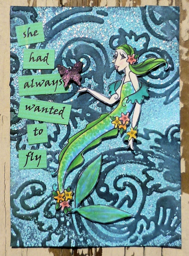
So.  Why are we here tonight?  I made this for a guest design over at Wicked Wednesday's "Blue" challenge.  We were given a great mermaid image by Michelle Perkett to work with.

Ingredients:
Digi/Stamp: (Mermaid): Michelle Perkett, (Butterfly): Stampin' Up

Paper: (Whisper White, Basic Black): Stampin' Up
Ink: (Broken China, Denim Jeans, Black Soot, Peeled Paint): Tim Holtz, (Versamark): Tsukineko
Misc: Copics, (Lt. blue EP): JoAnns, (Fine glitter): Stampendous, Pearl-Ex

Jar Full of Stars

Gee.  I'm typing this as I listen to Cyndi Lauper sing "Hat Full of Stars."  Apropos, no?

There's a challenge over at Unity right now to use stars.  I have some star stamps but I didn't just want stars.  I thought of other star stamps I have and I remembered stars hanging from strings.  What could I hang them from?  A branch.  Eh.  Not tonight.  Can they be put in something?  I'd love to bottle some stars up and enjoy the light for nights to come... which led me to this.

I was trying to figure out how to give it a bit of visual interest in the background but no embossing folders or stamps felt right.  Then I decided to go for some curvature in the jar, as if it really was coming off of the paper and I decided anything in the background then would possibly take away from it so I left it alone. 

To get the curvature, I adhered the jar edges directly to the background paper while triple stacking pop-dots along the center.
Here's another photo that I've darkened and increased the contrast so you can see that the jar has been heavily embossed with UTEE to give it a glassy look.  You can also see a bit that the stars and their halo have Twinkling H2Os applied to them to give them a nice shimmer.
 
Ingredients:
Stamps: (Twinkle, Twinkle; Jar of Sunshine): Unity
Ink/Coloring: (Black Momento, Black Staz-on): Tsukineko, (Colored Pencils): Crayola, (Watercolor Pencils): Staedtler, (Twinkling H2Os): Luminarte
Paper: (Basic Black, Yoyo Yellow, Night of Navy, Whisper White): Stampin' Up
Misc: (EP): Stampin' Up, (Twine): Whisker Graphics, (Tiny Attacher): Tim Holtz, Transparency

Challenges:
Unity Challenge: Stars
Unity Opportunity: Pick a Challenge
Frosted Designs: Twine/Ribbon
Moxie Fab: Tuesday Trigger: I definitely worked in more orange than I'd planned to in the stars but I think it was good to give them more depth.


Tuesday, August 14, 2012

Frank and the Missing Mrs. ATC

This post requires a warning and here it is.  If you don't want to get in my head (and I certainly don't!), stop reading now.  This will tell you what short but twisted path I took to come up with this idea and it's similar to that of my "Flying Monkeys ATC."  Odd.  Really odd.  If you're still reading, consider yourself warned.

As I mentioned yesterday, I've been in a scrapbooking mood and I sat down to work on that this evening.  I had a sketch in mind.  I had an inspiration piece in mind.  However, I was browsing through my Google Reader posts again just in case there was something else that jumped at me for the project and instead, I got caught up on the current Wicked Wednesday challenge post- Frankie and his Bride.  I actually thought I'd deleted it, deciding that I wasn't going to get to it because of the scrapping I wanted to get done this week.  Then I decided that I REALLY wanted to break out my Frankenstein stamp and try it.  So much for scrapping.  However, our tale isn't over.  I have Frank in a Stampin' Up set.  That's it.  One Frank.  No others.  And no bride.  None.  So.  What's Frank to do with his Mrs. missing?  Get upset of course.  Yell and holler.  That's great.  What would he yell?  Heck!  What's her name?  I don't know- does she have one?  Who else yells and hollers at some missing chickypoo?  What does he yell?  Marlon Brando.  Stella.  He yells.  Yeah.  Wait!  He yells STEL-LA!  I can see Frank doing that!  Heck.  Does he in Young Frankenstein?  He may.  I think I'll have to go back and watch it soon to find out.  Of course, I think it'll also require an Amazon order but that's ok.  Back on topic Jen.  Told you it was scary in here!

So.  End result.  One of those agate techniques from Tim on the glossy background paper (I like this one- the backgrounds are always pretty funky and you can keep messing with them.  I started with a 3 color layer.  Went to 4.  Ended on 5.)  I used the Blending Solution to remove some of the ink so the black letters showed up.  What didn't show real well were the black glitter bats up in the top left corner.  The glitter was too chunky.  You'll have this.

Ingredients:
Paper: (Glossy White, Whisper White): Stampin' Up

Stamp: (Booglie Eyes) Stampin' Up
Ink: (Alcohol inkers, Blending Solution): Ranger, (Momento Black, VersaMark): Tsukineko
Misc: Copics, (Glitter): Stampendous, (Heat & Stick Powder): Stampin' Up, (Alpha stickers): Creative Imaginations

Challenges: 
Wicked Wednesday: Frankie and his Bride
Simon Says Stamp: Favorite Technique (Agate, Fussy cutting)

Sunday, August 12, 2012

Have you seen AstroBrights papers by Neenah?

This is a Sponsored post written by me on behalf of Astrobrights Papers by Neenah Paper. All opinions are 100% mine.
Ok.  I'll start with my own disclaimer.  I haven't seen these papers in person.  I haven't touched them in person.  BUT!  I do know of Neenah's solid reputation (I have a friend who's an amazing Copics artist and she uses a LOT of Neenah white) and I do know that some of the projects I've seen pictured, both consumer and Neenah's, look solid and gorgeous.  Because of that, I wanted to write this post to at least make you aware of something that looks like a great product.
The colors of these papers are simply amazing.  AstroBrights is definitely a fabulous name for the line!
Not only are they, bright but they also seem to hold up well to folding.  Unfortunately I seem unable to link to a Facebook photo so just head to Astrobrights on Facebook to check them out.
The papers come in two different weights- text for your fliers, kids' reports, etc., and cover weight for your crafting projects.
Astrobrights is running two different promotional contests right now.  There's the "Give a Brighter Year" sweepstakes" sweepstakes where the randomly selected winner will get $30,000 worth of Neenah paper and other school supplies donated to their school (elementary or middle schools (kindergarten up to 8th grade only, in US and Canada only.  Check out the rules for the specifics please!)  How much would your kid's school appreciate THAT one?!?
The second contest is an ongoing challenge on their Facebook page.  It's the "Make Something AstroBright" design challenge.  Right now the challenge is to make paper flowers from the AstroBright papers and some are simply amazing!  Even if you don't participate (but if you have some of this paper, why wouldn't you?!), definitely have a look at their FB page to see some of the entries!

Visit Sponsor's Site

Farm Day Layout

It's funny.  Once I scrap for a month or three, I'm over it and want to make cards.  Once I make cards for a month or three, I'm over it and want to scrap.  Scrapping time it is.


Ingredients: 
Paper: (Latte, Ghosts & Goblins, Citrus stacks): DCWV, (Very Vanilla, Whisper White): Stampin' Up
Stamps: (Banner): Unity, (Fall Whimsy): Stampin' Up
Ink: (Old Olive, Really Rust, Real Red, Only Orange, True Thyme, Summer Sun): Stampin' Up, (Momento Black): Tsukineko
Misc: (Distress Markers): Tim Holtz, (Ribbon): Crate Paper, (Twine): Divine Twine, Whisker Graphics, (Border punch): ?, (Thickers): American Crafts

Challenges:  
Simon Says Stamp: Favorite Technique (When DON'T I fussy-cut?!)  
DCWV: August Stack-a-holic sketch

Thursday, July 26, 2012

Grungeboard Bracelets

In addition to the funky shrinky dinks, I'm also making grungeboard bracelets for my two besties who I'm going to hang with at CKC all weekend.  I haven't seen them in over a year so I'm pretty psyched to get going.

I saw these bracelets over at Linda Ledbetter's Studio L3 and I decided I HAD to make them.  It took a while to get the hang of bending the metal bands- unfortunately my fav, the first I worked on (DUH!) went the way of the dodo when I bent it too hard.  My new one started to crack so I left well enough alone.

I've only finished mine- I want to make sure the fit is right on the other two and let them pick their ribbons out.  For mine, I used the TH stains to color the grungeboard and used acrylic for the EF.  For the other two, I used all acrylic- I didn't want them to bleed at all so I rethought what I was doing.  I did tint the ribbon with yellow and orange SU craft inks.


Challenges: Simon Says: Hey Girl

Fun "Shrinky Dink" pieces

I went to the Stamp and Scrap Art Tour this past weekend and found a neat product at "Darcie's" booth- it's a white shrink film with a CD of images to print from an ink jet printer.  I picked up the vintage pack and made some of the tiles this week.  The film is great- it doesn't stick to itself- but I did find that a lot of my images went "pink" when I shrank them.  Not sure why but they're still cute.  I jazzed them up with some pearls and beads I attached with headpins.  I also stamped flourishes and text on the back of the pieces before shrinking so they aren't stark white.  I'm going to share these with some friends when I get to CKC Friday.

Challenges: Simon Says: Hey Girl

Friday, July 20, 2012

GHWI's Christmas in July... with a Tag!

Happy Friday!  Hope you've all had a great week and you're looking forward to the weekend!

For this installment of GHWI inspirational projects, I used the uber-cute Pain and Pride set.
I have a bag of small tags that I've been looking for the perfect use for- the "merry" sentiment fit beautifully on them!

Don't forget that you can get a 2nd entry into our monthly drawing if you use an ippity or Unity stamp on your creations.  You can also find us at our GHWI Facebook page and our forum over at the Crafter's Cafe.
Ingredients:
Stamps: (Pain and Pride): ippity, (Alphas): Studio G
Paper: (Whisper White): Stampin' Up, (DP): SEI
Misc: (Twine): Whisker Graphics, Copics, Watercolor Pencils

Challenges: 
Jingle Belles: Red OR Green 
Crafter's Cafe: Non-traditional Xmas colors
Two Peas: Christmas in July

Sunday, July 8, 2012

Beachy return to ATCs

I've been wanting to do an ATC or three for the challenges over at Wicked Wednesday but just haven't had the chance recently.  However, since I have a few guest design weeks coming up over there, I kinda feel like I certainly must show my face... if I'm not too embarrassed to.  :)  So I spent some time last night putting together an ATC for their "Life's a Beach" challenge.


Stamps: (Sun): Verve Stamps, (Surfer Boy): ? but I believe they've gone out of business
Ink: (Black Momento): Tsukineko
Paper: (Whisper White, Yoyo Yellow, Kraft): Stampin' Up (Orange yellow, tan): ? (Striped DP): October Afternoon
Misc: (Glossy Accents): Stampin' Up, Copics, Watercolor pencils


Challenges: Wicked Wednesday: Life's a Beach

Friday, July 6, 2012

GHWI's Christmas in July

How did we get halfway through the year already?!?!

For our Christmas in July challenge over at  Get Hippity with Ippity, I wanted to use the fun but elegant Kissmas and Mistletoe set. 


Come on over to Get Hippity with Ippity to jump in on this challenge!  While you don't have to use an ippity or Unity stamp, you'll get a 2nd entry into the end-of-the-month random drawing for an ippity set of your choice, awarded by Aletha Williams!  You can also check our FB page and our forum over at the Crafter's Cafe.

Ingredients:

Stamps: (Kissmas & Mistletoe): ippity
Paper: (Real Red, Vellum tag): Stampin' Up, (Dk. red): Michaels
Ink: (Versamark): Tsukineko
Embossing Powders: (Black Distress): Tim Holtz, (Bridal): Personal Stamp Exchange
Ribbon: (Swirls): May Arts

Challenges:
Christmas Card Challenge #31: Monochromatic
The Paper Players #102: Christmas in July
DYSU #79: Red

Thursday, July 5, 2012

GHWI's Christmas in July... pt2

So.  Just as I was about to post the red card, I was looking over an Apron Strings Pinterest challenge and decided that I wanted to use the Kissmas and Mistletoe set for the challenge.  So.  Why not do a 2nd Get Hippity with Ippity inspiration card.  But what design to use.  Wait.  What's wrong with doing the same as what I already have.  But different.

These pix are of the same card, just taken in different lighting.  This one's definitely tricky to photograph.


Again, come on over to Get Hippity with Ippity to jump in on this challenge!  While you don't have to use an ippity or Unity stamp, you'll get a 2nd entry into the end-of-the-month random drawing for an ippity set of your choice, awarded by Aletha Williams!  You can also check our FB page and our forum over at the Crafter's Cafe.

Ingredients:
Stamps: (Kissmas & Mistletoe): ippity
Paper: (Whisper White, Vellum tag): Stampin' Up, (Pearl Paper): Rag Shop

Ink: (Versamark): Tsukineko
Embossing Powders: (Silver): JoAnns, (Bridal): Personal Stamp Exchange
Ribbon: (Swirls): May Arts

Challenges:
Christmas Card Challenge
#31: Monochromatic
The Paper Players #102: Christmas in July
Apron Strings Pinterest #3:

Friday, June 29, 2012

2nd Birthday page

For some reason, I'm kickin' butt and takin' names when it comes to birthday layouts recently.  Yeah.  Kickin' butt.  Takin' names.  I had to say it.  Dunno why.  Just had to.

This was designed for a Club CK Recipe Challenge: summertime photos, envelope mini album, a transparent element, a monogram (single large letter), and an accent cut from patterned paper.  The summer photos are obvious, the envelope album... I made mini envelopes from cardstock to fit the trimmed photos.  I haven't glued it down because I need to figure out how I want to attach it and cut the page protector so you can get to the photos.  The monogram... I went with a number.  The banner is from patterned paper and the year is under clear fragments.

Ingredients:
Paper: (Blue CS): Michaels, (Yellow DP): Lily Bee Design, (Blue Dark Denim Flourish-Double Dot): BoBunny, (Funfetti-Carnival (banner)): We R Memory Keepers
Stamps: (Brushstroke Numbers): Stampin' Up
Ink: (Whisper White): Stampin' Up
Misc: (Fragments): Tim Holtz

Tuesday, June 26, 2012

First birthday pages

Well, they are first birthday pages, just not MY kid's first birthday.  :)


Ingredients: Except the Thickers and mist, all items came from Studio Calico's Apr. kit
Paper: (White CS): (Cream CS): Bazzill? (Floral DS): Sassafras (for SU), (Green DS- Pretty Party): Crate Paper
Misc: (Pickle Mr. Huey, Butterfly masks, Butterfly stickers): Studio Calico, (Cupboard Thickers): American Crafts, (Brads- Pretty Party): Crate Paper

Challenges:
Sketches In Thyme
#82: